ARTICLE
Define purpose and personality
Be explicit about what the site exists to do: a marketing landing page, a portfolio, an experimental piece, an online shop, or an editorial hub all require different choices. Pick a tone—playful, minimal, brutalist, luxe—and let that voice inform copy, layout, microcopy, and interactions so the whole site reads as one coherent personality.
- Write a short one-sentence purpose statement and pin it to the project board so design choices always have a north star to check against.
- Pick two or three personality words and add them to the moodboard to guide type, color, and motion decisions consistently.
- Draft a quick elevator pitch you can read aloud to confirm the visual direction matches the intended message and tone.
Content-first thinking
Let content drive structure. Design the hierarchy around the story you want users to experience instead of inventing features first. Prioritize clarity and information scent so creative choices don't confuse visitors.
- Create a content inventory listing pages, sections, and primary CTAs so you don't design features nobody needs.
- Map the content hierarchy for your main templates (H1, H2, lead, CTAs) so visual emphasis follows meaning.
- Prepare real copy or realistic placeholders early so typography and layout aren't derailed by unexpected text lengths.
Typography
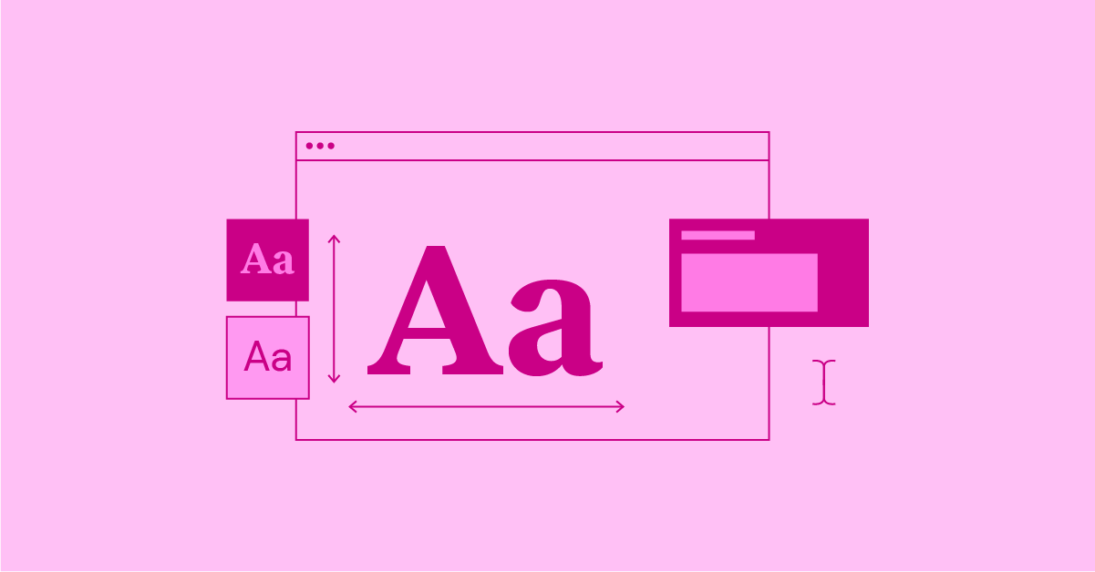
Typography sets the foundation of any creative website — it shapes first impressions and carries your message before anything else does. If your type doesn't match your story and identity, the whole design falls apart.
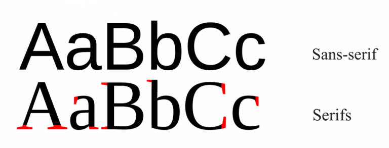
Font families
Serif faces have small decorative “feet” and feel sophisticated; sans-serif faces are clean and modern; monospace types give equal character widths and are ideal for code blocks. As a developer I prefer system or well-hinted web fonts for body text to reduce layout shifts and improve load times, and I reserve expressive display faces for headings only.
Font settings
Treat weight, size, leading/line-height, and tracking/kerning as deliberate controls; tuning these creates clear hierarchy. Use a consistent scale (3-5 sizes) and aim for comfortable measure. In practice I set a base size, then define H1-H3 and body with relative units and clamp() for responsive scaling, plus sensible fallbacks to keep layout stable while fonts load.
Contrast
Color contrast ensures legibility; form contrast (size differences) creates readable hierarchy. Aim for 3-5 sizes and make steps between them noticeable. Use an accessibility contrast checker during design and test in the browser; for measure, target roughly 45-75 characters per line and adjust line-height to match.
Alignment
Left align for long reads; center align is fine for short headlines or intros; avoid right alignment except for specific visual effects. Keep headings short (2-3 lines) and body copy comfortably readable. As a rule I avoid justified text unless hyphenation and careful micro-adjustments are applied.
Practical developer preferences
As a developer I prefer: using font-display:swap; subsetting heavy web fonts; loading critical CSS for typography inline; and using CSS variables for type scales so designers can tweak values without touching markup. I also prefer rem-based spacing tied to a single root size to keep vertical rhythm predictable across breakpoints.
Where to find fonts
Free options: Fontshare, Google Fonts, Uncut.wtf. Premium: foundries like Pangram Pangram and Swiss Typefaces. When choosing a paid face I look for variable fonts to consolidate weights and improve performance.
Colors

Color should do work beyond decoration: it evokes emotion, directs attention, and tells your story before a single sentence is read. Be deliberate and restrained; organize colors by role (dominant, supporting, accent) and test contrast.
- Decide dominant, supporting, and accent roles so color use is purposeful rather than decorative.
- Test contrast for text and UI components to ensure readability across devices and conditions.
- Separate identity tokens (primary/secondary) from layout color choices so brand vs composition decisions stay distinct.
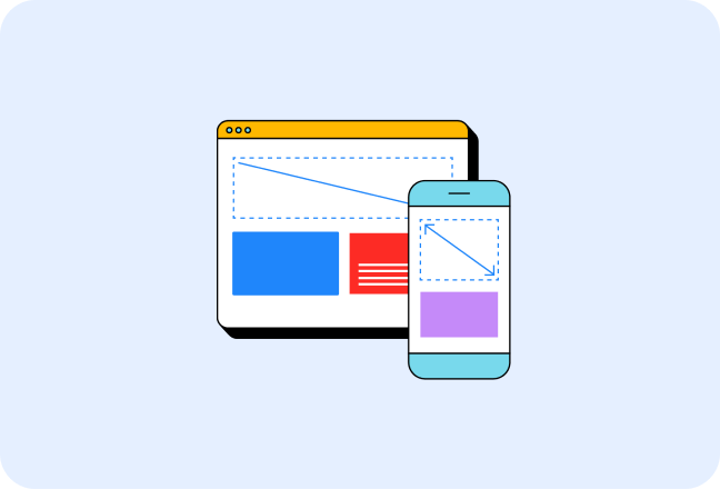
Grids & Layouts

Grids are tools that structure creative ideas. Learn a system well so you can bend it intentionally; use column, modular, or editorial grids depending on content needs.
- Set margins and gutters up front so spacing is predictable across templates.
- Define breakpoints and stacking rules to avoid ad-hoc responsive fixes later.
- When breaking the grid intentionally, document where and why so the design system stays consistent.
Animations
Animation guides attention and clarifies interactions when used intentionally. Focus on timing (delays), sequencing (staggers), and easing; master a few techniques and reuse them consistently.
- Scroll tracking: map scroll progress to transforms for immersive layouts.
- Viewport detection: trigger entrance animations only when elements enter view to save resources.
- Sticky positioning: anchor elements that change context while you scroll.
- Easing: choose curves appropriate to intent—entrances vs toggles vary.
- Text splitting: animate lines, words, or characters for refined typographic motion.
TLDR;
- Write one short sentence stating the site's purpose and keep it visible so every design choice can be checked against it.
- Pick two or three personality words and pin them to the moodboard so type, color, and motion all read the same way.
- Create a content inventory listing pages and CTAs so you don't design features nobody needs.
- Map content hierarchy for main templates so visual emphasis follows meaning.
- Prepare real copy or realistic placeholders early so typography and layout don't surprise you later.
- Choose a column grid and breakpoints, write stacking rules, and sketch mobile/tablet/desktop wireframes so responsive behavior feels intentional.
- Pick primary and secondary typefaces, set a modular type scale and line-heights, and plan fallbacks so text is reliable and fast.
- Select a restrained color palette, test contrast, and write quick usage rules so editors don't invent new colors later.
- Define image treatments, set responsive srcsets, and optimize assets so visuals are crisp without dragging performance.
- List where motion is required, choose timing and easing, and add reduced-motion options so animations add clarity rather than confusion.
- Decide navigation and mobile menu behavior, write microcopy for CTAs and errors, and test common flows so users never guess how to proceed.
- Add semantic HTML, keyboard support, contrast checks, and captions/transcripts so your site works for more people.
- Run a Lighthouse check, lazy-load above-the-fold assets, and trim third-party scripts so the site feels snappy.